

Diving into Web Components with XM Cloud Component Builder

XM Cloud Components Builder is in early access and is the recommended approach to build components for your XM Cloud apps. Components Builder is a Frontend as a Service (FEaaS) that lets you create your brand’s style guide and build visual components in a WYSIWYG editor.
The underlying technology to get your components to the screen is Web Components. Web Components built by Component Builder quickly drop into your XM Cloud app, BUT they also can be used standalone without XM Cloud in any JavaScript framework or even .NET web apps.
I recently experimented with the XM Cloud Component Builder and built the SUGCON North America site. Even in early access, I enjoyed the experience. One thing that intrigued me was the use of Web Components, so I had to dig into them deeper.
Please continue reading to explore Web Components, their benefits, and how XM Cloud Component Builder uses them to create modular and reusable UIs.
What is a Web Component
A Web Component is a self-contained, single-responsibility, and reusable custom element for the web. Web Components allow developers to build a modular component-driven UI that can be easily integrated and reused across different projects and frameworks.
Web components are a set of web platform APIs that allow you to create reusable custom elements for web applications. Web Components are part of the web standards: Web Components.
Three main technologies make up a Web Component:
- Custom Elements: Elements are the building blocks of the web. There are predefined ones like
<h1>, <p>, or <img>. However, with Web Components, you create custom elements. For instance, you could create an element called<Sitecore-branded-button>, encapsulating all the style and functionality of a branded button. In the case of XM Cloud Component Builder, it will generate the<feaas-component>custom element. FEaaS is the acronym for Frontend as a Service. - Shadow DOM: The Shadow DOM encapsulates and self-contains your custom elements. It prevents styles from apps getting in or styles from your elements leaking out. Web Components are meant to be 100% self-contained, with no secondary effects.
- HTML Templates: Templates allow you to define the structure of your component without rendering it immediately. Think of this as the blueprint for your Web Component. Pass in the proper data or set the data source and let your beautiful HTML template render.
If working with the XM Cloud Component Builder, you do not need to worry about Custom Elements, the Shadow DOM, or HTML Templates explicitly. The builder does a lot of that work for you letting you focus on creating your components that drop into XM Cloud or any other web app.
💡 Standard Web Components run 100% in the browser, so rendered client-side. However, the Sitecore JSS team has done some great work to render XM Cloud Components as React Server Components for certain environments. So if you are on Sitecore JSS version 21.2.* or above and building in Next.js or React your XM Cloud Components will work in SSR or SSG applications! Check out my step-by-step guide on upgrading to Next.js JSS version 21.2.*.
Benefits of Web Components
- Encapsulation: The Shadow DOM, mentioned above, completely isolates your Web Component from the rest of your app. Styles cannot leak out or get into your Web Component. Encapsulation is a GREAT feature, but it does mean you need to consider global styles in your app and apply those in your Web Component. Even global styles in the app will not automatically apply to a Web Component.
- Reusability: Web Components promote reusability because all the functionality and styling are encapsulated. Use them as often as you want in your app to reduce duplicative code.
- Framework Agnostic: Web Components are not tied to a specific framework. They are based on web standard API so that the same Web Component can be used in vanilla JavaScript, Next.js, React, Vue, or any JavaScript-based framework. As mentioned, standard Web Components are loaded client-side, so the work is all done in the browser.
XM Cloud Component Builder follows Web Components standards, so you will see these benefits if you build with it. The most significant advantage is that Web Components are framework agnostic. You develop your component once and share it among your different web apps. Drop in the custom element and a <script> where your app can find the code for your Web Component, and it just works. See more on how this works below.
💡 Browser Compatibility: Most modern browsers support Web Components. Browser Compatibility should not be an issue as long as users use a reasonably modern browser.
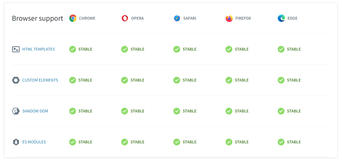
Source: https://www.webcomponents.org/
XM Cloud Component Builder
XM Cloud Components Builder is a Frontend as a Service (FEaaS) Web Component builder. Its main use case is to build modular frontend components for your XM Cloud sites. It’s important to realize that the components you build are Web Components. Because it means you get all the benefits from the above section, encapsulation, reusability, & framework agnostic.
Encapsulation: Component Builder handles the technical aspects around custom elements, shadow DOM, and HTML templates. Ultimately, you get access to the custom element <feeas-component>, which encapsulates all the functionality of the component you built. With a few properties passed into the <feeas-component> custom element, your component will display.
Reusability: Easily share your components across sites and even your Sitecore organization. Build a component once and use it everywhere.
Framework Agnostic: Integration with Component Builder and XM Cloud is seamless. It’s as simple as dragging and dropping the component onto the screen in the XM Cloud Pages app. But it doesn’t stop there. That <feeas-component> can be used in any HTML based web app. Framework agnostic means you get the ultimate reusability.
Server-Render Capable: If you are using Sitecore JSS 21.2.* or above on React or Next.js your <feeas-component> will be rendered on the server, reducing the load on the client machine. This means support for SSR and SSG. This is a big benefit and makes upgrading JSS well worth it. XM Cloud Components still work on earlier JSS versions, however they will be rendered client-side.
Putting XM Cloud Components On Your Pages
I’m assuming you already have a component or two created for the below steps of adding them to your pages.
Using XM Cloud
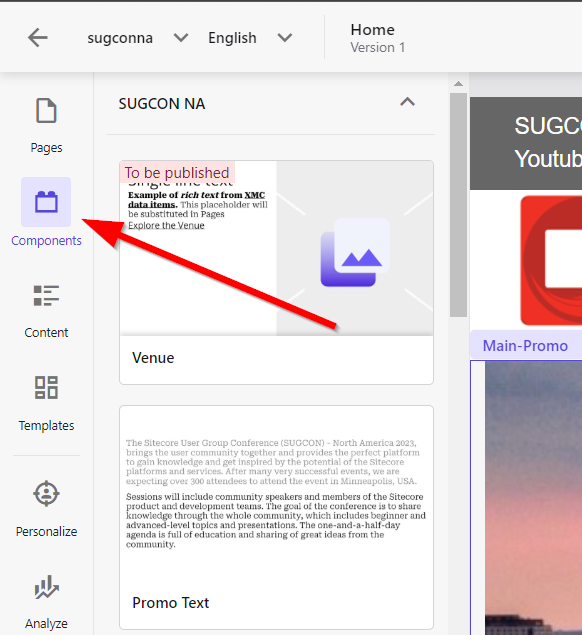
XM Cloud is the easiest method, go figure. It’s drag and drop. Select Components from the Pages screen in XM Cloud, and you'll see your component collections. Find the component you want on the page, then drag and drop it wherever you want it on your page.
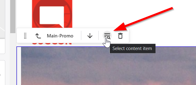
Once your component is on the page, select it and choose the icon with the magnifying glass to select a content item. This content item is your data source. You can skip this step if all the content in your component is hard-coded.
And that’s it. You’ve got your component on the page with XM Cloud.
Using other Web frameworks
If you want to use your XM Cloud Components outside of XM Cloud, it’s straightforward.
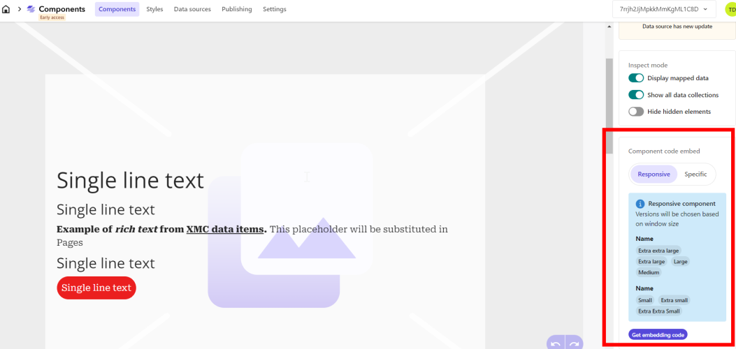
First, navigate to the component you want to have on your page. And in the bottom right of the page, you’ll find the “Component code embed” section. Click “Get embedding code”
In the modal that pops up, select the “Web Component” tab. You’ll see the code you need in order to get the Web Component on your page. Notice my example below has the data property set with sample data. My component uses a data source to populate it, so this is how you pass data to your Web Component.
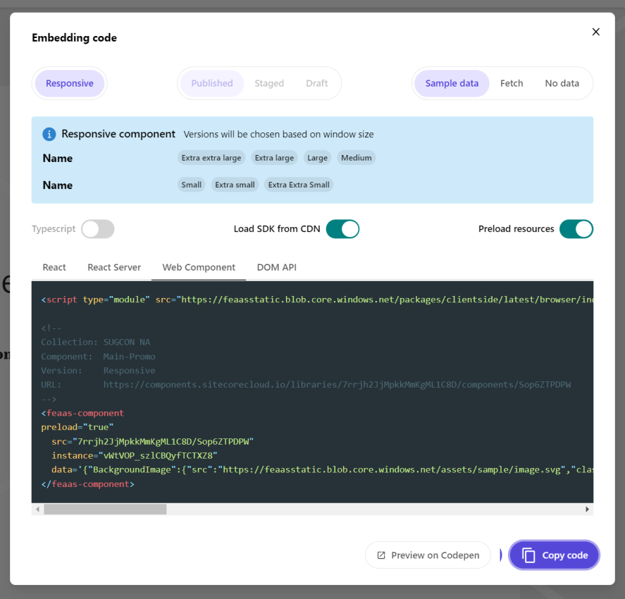
Drop the above code into any framework, and your Web Component will be displayed. Please note that the exact implementation may differ depending on your framework. For example, Next.js has its own <Script> element. Below is the code for a Next.js example.
1<Script type="module" src="https://feaasstatic.blob.core.windows.net/packages/clientside/latest/browser/index.esm.js" />
2<feaas-component
3preload="true"
4  src="7rrjh2JjMpkkMmKgML1C8D/Sop6ZTPDPW"
5  instance="vWtVOP_szlCBQyfTCTXZ8"
6  data='{"BackgroundImage":{"src":"https://feaasstatic.blob.core.windows.net/assets/sample/image.svg","class":"scEmptyImage","alt":"","width":"580","height":"386"},"Description":"<p><b>Example of <i>rich text</i> from <a href=\"#\">XMC data items</a>.</b></p><p>This placeholder will be substituted in Pages</p>","Label":"Single line text","Link":{"href":"https://www.sitecore.com"},"Text":"Single line text","SubText1":"Single line text","SubText2":"Single line text"}'>
7</feaas-component>
The general implementation will be the same. Use a <script> tag to tell your application where it can find the implementation of <feaas-component> and then let Web Components do the rest.
Conclusion
XM Cloud Components Builder is in early access, so expect changes and more features to come. Right now, it is an effective tool for building modular UIs for XM Cloud. It has the added benefit of using Web Components, so you get encapsulation, reusability, and framework agnostic.
I recently built all the components for SUGCON North America with the Components Builder and enjoyed the experience even in early access. I’m excited to see what comes next.